
WPF – Animation
Animation can explain whatever the mind of man can conceive.
Walt Disney
One of the more powerful UI features in WPF is animation. There are a group of related classes DoubleAnimation, ColorAnimation etc that allow a transation between two values for a single property over a specified time period. However, it’s not immediately clear how to trigger such an animation in an MVVM pure manner.
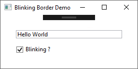
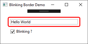
The class I’m going to introduce in this post uses an animation to provide a visual signal to the user when a simple colour change just isn’t sufficient. perBlinkingBorder extends the standard WPF Border class – adding two new brush properties, one for the static state and one for the blinking state, and a boolean IsBlinking property that will trigger the blinking state.
The animation is defined in a style trigger bound to the IsBlinking property. When this value is set to true, an animation storyboard is activated.
<Style TargetType="{x:Type vctrl:perBlinkingBorder}">
    <Style.Triggers>
        <Trigger Property="IsBlinking" Value="True">
            <Trigger.EnterActions>
                <BeginStoryboard>
                    <Storyboard TargetProperty="(BlinkingBorderBrush).Opacity">
                        <DoubleAnimation
                            AutoReverse="True"
                            RepeatBehavior="Forever"
                            From="1"
                            To="0"
                            Duration="0:0:0.5">
                            <DoubleAnimation.EasingFunction>
                                <SineEase EasingMode="EaseInOut" />
                            </DoubleAnimation.EasingFunction>
                        </DoubleAnimation>
                    </Storyboard>
                </BeginStoryboard>
            </Trigger.EnterActions>
        </Trigger>
    </Style.Triggers>
</Style>
The desired blinking effect is achieved using the brush’s opacity – animating between 0 (effectively invisible) to 1 (fully visible). The AutoRepeat, RepeatBehavior and Duration properties of the DoubleAnimation instance are set to appropriate values.
Animations also offer a range of easing functions if you want something other than a straight linear transition between the From and To values. To be honest though, these make little visible difference for a colour based animation as in this case – they’re much more useful if say you’re animating the position of a control on the screen.
If you want to animate multiple properties at the same time, just add another BeginStoryboard element to the Trigger.EnterActions with the required Storyboard / Animation objects.
The demo project shows a handy way to use this control if you’re already using a grid to define sizing and alignment for the controls in a view. Use a negative margin value, and the border will be drawn outside the grid cell boundaries.
As usual the code samples for this blog are available on Github, along with my own personal C# / WPF library.
If you find this article useful, or you have any other feedback, please leave a comment below.