WPF – Data Binding (Check Boxes)
I’m not really interested in being a superhero. That’s not a box I’ve been trying to check off.
Chadwick Boseman
In my previous post I demonstrated how to handle the data-binding so that user can select a single value from a mutually exclusive group, using radio buttons. To keep the logic clean and MVVM pure, I used a single enum value as the binding source, rather than multiple boolean properties. This post demonstrates a similar requirement – this time allowing the user to select any combination of values from a group (including none). Again we’ll use a single enum value to handle the selection, although to support multiple selection this enum type must be defined with the Flags attribute. For the UI, we’ll use a set of CheckBox controls.
To handle the data-binding for a multi-select group, you need a single property of the enum type that will hold the selected enum members, and then for each selectable members (as shown in the demo project for this post, you don’t have to provide selectors for every member of the enum type) a CheckBox control.
I have seen implementations that use a value converter class to handle the link between each CheckBox’s IsChecked property and this enum value. However, as there are two data values to manage (the selected enum members, and the member corresponding to each CheckBox), this requires some kind of overall state held within the value converter, which is then bound elsewhere – a construct that I find rather messy, as well as requiring a different converter instance for each CheckBox group.
My solution is to take an alternative approach – extending the standard CheckBox class to meet our requirements.
perFlagsCheckBox inherits directly from CheckBox, adding two new properties
- FlagsEnum – all items in a CheckBox group are bound to the same enum property on the ViewModel
- CheckedValue – this is bound to a single member of the enum type, to identify which enum element each perFlagsCheckBox instance corresponds to
as well as the logic to update the FlagsEnum value whenever the CheckBox is checked or unchecked.
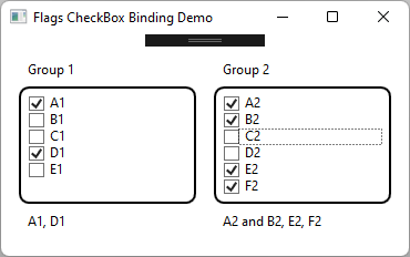
The demo project shows this control in action. Rather than manually creating perFlagsCheckbox instances for each selectable enum member, I’ve used an ItemsControl with an appropriate ItemTemplate.
    <ItemsControl
        Grid.Row="2"
        Grid.Column="0"
        ItemsSource="{Binding Enum1Items}">
        <ItemsControl.ItemTemplate>
            <DataTemplate>
                <vctrl:perFlagsCheckBox
                    Content="{Binding Display}"
                    FlagsEnum="{Binding RelativeSource={RelativeSource FindAncestor, AncestorType={x:Type ItemsControl}}, Path=DataContext.E1}"
                    CheckedValue="{Binding Value}" />
            </DataTemplate>
        </ItemsControl.ItemTemplate>
    </ItemsControl>

    ...

    <TextBlock
        Grid.Row="4"
        Grid.Column="0"
        Text="{Binding E1}"
        TextWrapping="Wrap" />
Enum1Items is a collection of perValueDisplayPair items for the required enum members. perEnumHelper.MakeValueDisplayPairs() has been extended to allow specific enum members to be included / excluded, rather than just including every member of the enum type. For a multi-select flags enum type, I recommend always including members for None and All in the enum, as well as the individual selectable members and any other sub-groupings you might require.
Within the ItemsControl, a perFlagsCheckBox instance will be created for each item in the collection, with Content (the text next to the CheckBox) bound to Display (which will use the enum member’s description attribute if set), and MaskEnum set to the enum member’s value. FlagsEnum uses RelativeSource binding to bind to a propety of the MainViewModel.
The TextBlock below displays the selected enum members, its Text is bound to the description value for the same flags enum property as the CheckBoxes. perEnumHelper has been updated so that the Description() method now copes correctly with flag enum values.

As usual the code samples for this blog are available on Github, along with my own personal C# / WPF library.
If you find this article useful, or you have any other feedback, please leave a comment below
