
MVVM – Validation
I have never, ever sought validation from the arbiters of British poetic taste
Linton Kwesi Johnson
In this post I’m going to look at how to validate user-entered data in a WPF / MVVM application.
The context is that the user will be presented with a (cloned or new) Model instance to edit, and will not be allowed to proceed until all of the validation rules for that Model type are passing. In line with this blog series, I’ll be aiming to do that in a structured manner, with as little duplicated code as possible
Validation within WPF / MVVM is provided by the IDataErrorInfo interface, which has just two members …
public interface IDataErrorInfo
{
    string this[string propertyName] { get; }
    string Error { get; }
}
The indexed Item[] property takes a property name as the parameter, and returns a string value for the error message, or a blank string if validation passes for that property. This interface has actually been available in .net since version 1.1 – long before WPF was created – and it turns out that in WPF the Error property is redundant. So can one simple indexed property provide all that is is required for validation? Well it’s not quite the whole story, but it certainly is an important part of the process.
Validation through IDataErrorInfo
IDataError info needs to be implemented on whatever the specific control is actually bound to. This could be the Model itself, or if required on the ViewModel (which will indirectly set a corresponding property on the Model). An example of this latter case is PersonViewModel.DepartmentVm in the demo StaffManager application. Continuing with out D.R.Y. theme, this duel use suggests that the behaviour should be defined in a common base class for both Model and ViewModel classes. perObservableObject implements IDataErrorInfo, along with a virtual ValidateProperty() method that should be overriden in descendent classes to perform the actual validation as required for each individual property, and an IsValid property for the whole class instance.
Due to our use of PropertyChanged.Fody in Model classes – there are no concrete property setters where linked properties can automatically be re-validated. To get around this, the base class for Models – perModelBase, includes a static AddPropertyDependency() method, which is used to define a link between two properties. Each time the source property is updated, the PropertyChanged event will be invoked for the dependent property, which in turns refreshes the validation for that property. In the demo project for this post, the validation rule for school name partly depends partly on the person’s age, so needs to be re-evaluated whenever the age property is updated.
Validation in DataBinding
So having created a method for validating properties in a Model or ViewModel class, how do we go about actually calling it? The second step of the validation process is in the data binding. Set the ValidatesOnDataErrors flag in the Binding declaration to True. For example …
<TextBox Text="{Binding Model.Name,
                UpdateSourceTrigger=PropertyChanged,
                ValidatesOnDataErrors=True }" />
Now, each time the bound property is updated (after each key-stroke in this case due to UpdateSourceTrigger= PropertyChanged), the validation Item[] property will be evaluated with the bound property name as the index parameter.
Displaying Validation Results
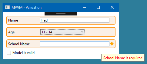
An additional bonus of using IDataErrorInfo, is that a WPF control whose data binding has failed validation will indicate this state by drawing a red border around itself, without us having to do any extra work. The last part of this post will demonstrate a way to modify this aspect of the user-interface.
The display of error information for a control is defined by its Validation.ErrorTemplateProperty – another example of an attached property. This control template is used to define additional U.I. elements, that are drawn on the adorner layer of the form, around the control that it is attached to, whenever its data bound property fails validation. This is where the default red border comes from. Within an error template, AdornedElementPlaceholder is a placeholder for the control that the template is attached to – AdornedElement is the actual control.
It would be nice to have a common styling and behaviour, including displaying errors, that can be applied to any WPF control – without having to write new control templates for each control type. perControlHost meets just that need. It is used to create a visual wrapper around any existing control definition, offering a coloured background / border and a text caption, in addition to the error state indicator and error message displayed as a tooltip. The default validation template for perControlHost is slightly more complicated than the WPF default …
<ControlTemplate x:Key="ControlHostDefaultValidationErrorTemplate">
    <Grid>
        <Grid.ColumnDefinitions>
            <ColumnDefinition Width="*" />
            <ColumnDefinition Width="Auto" />
        </Grid.ColumnDefinitions>

        <AdornedElementPlaceholder Grid.Column="0" VerticalAlignment="Center" />

        <Path Grid.Column="1" Width="12" Height="12" Margin="2,0,0,0" VerticalAlignment="Center" Data="M 0,0 M 200,200 M 150, 186 L 50, 14 M 200, 100 L 0, 100 M 150, 14 L 50, 186" SnapsToDevicePixels="True" Stretch="Uniform" Stroke="Red" StrokeThickness="2" UseLayoutRounding="True" />
    </Grid>
</ControlTemplate>
The visible element of this template is a red asterisk on the right edge of the control, to indicate the error state.
The second half of the U.I. for validation is a tooltip on the control host, to display the text of the error message. This is defined in the control template for perControlHost. Tooltips exist outside of the standard visual tree though, so they can’t reference another control by name or use any other form of data binding to get their text content. All that a tooltip knows about is its own PlacementTarget – the UIElement that it is displayed against, in this case the border. To allow the tooltip to access the wrapper’s content property (i.e. the control that is being hosted), I’ve used data binding to hijack the (otherwise unused) Tag property of the border. Note the parentheses in the data trigger binding – these are required because Validation.HasErrors is an attached property.
The demo project for this post shows the full validation process in action, including dependent property validation, and how perControlHost.ValidationErrorTemplate can be used to define an alternative template for a specific instance. For this demo, the data model class is defined in a separate project, so we can apply Fody.PropertyChanged just to the classes in that assembly.
As usual the code samples for this blog are available on Github, along with my own personal C# / WPF library.
If you find this article useful, or you have any other feedback, please leave a comment below.
I certainly hope you will continue this mvvm series. Very good info indeed!