
WPF – Custom Window Chrome
Let’s have a look through the round window …
Templating in WPF provides a way of altering the look and feel of a standard control, in as radical a way as your imagination can dream up. One of my first encounters with WPF was a demonstration of how you could change all of the buttons in an application to take a circular shape with just a few lines of xaml code.
This customisation could extend to the entire application – the basic building block of the UI, the Window class can be styled in a similar manner. As this post will show though, it’s not quite as simple as just defining a new control template.
If we want to completely remove any of the existing styling from a window and start with a clean slate, this can be achieved with just a couple of property setters
WindowStyle="None"
AllowsTransparency="True"
However, this doesn’t produce a particularly useful result though – just a white rectangle with zero features.
So now we have to add back any required styling and functionality. As previously perViewBase.cs and perViewBase.xaml provide a base class for all application windows, but with many more features than previously included. Note that the demo project for this post uses its own (cut down) version of the Peregrine.WPF.View library project, which just contains suffient to show this feature in action, as I didn’t want to pollute the other demo projects with non-standard looking windows.
The key features of this enhanced view base include
- A new window chrome layout, with rounded corners
- Hiding the close button (and invoking the perBlockWindowAltF4CloseBehavior) when CanClose is set to false.
- Replicating the standard maximise and minimise buttons, but with enhanced tooltips.
- A help button – this just launches the named help file using the application associated for that file type in the operating system.
- A resize grip – this is displayed when ResizeMode is set to CanResizeWithGrip.
- A set of dragable resizing rectangles that replicate the standard window edge / corner resizing behaviour, and code to handle the window resizing when one of these is dragged. There is a standard WindowChrome class that could be used to provide this functionality, but that caused isuses with the rounded corner layout.
- A new TitleBarContent property that allows any UI element to be placed in the window titlebar, alongside the standard Title text.
- Dragging on the titlebar area will move the window.
- Double-clicking on the titlebar area will toggle between maximised and standard modes.
The message dialog service will also use this custom rounded corner look as perDialogBase inherits from perViewBase.
Note the new IAllowClose interface for ViewModels to allow business logic, including cancelling the operation, to be performed before a window is closed.
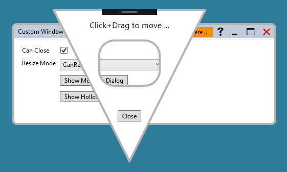
There’s no reason why a window UI has to maintain a rectangular-ish shape. Although the underlying window will always be rectangular, due to the WindowStyle & AllowsTransparency properties being set as outlined above, the visible portion can be any shape you like. The HollowView component in the demo project shows this in action. Due to the null background, any part of the window that doesn’t contain any other control will be treated as transparent, even to mouse clicks and other events. This applies both to the exterior regions and the central hole.
As usual the code samples for this blog are available on Github, along with my own personal C# / WPF library.
If you find this article useful, or you have any other feedback, please leave a comment below.