
WPF Controls – Xaml Icon Host
To be an icon … I guess that’s a privilege.
Adam West
In this post I’m going to present another of the controls that I’ve developed to complement the standard WPF classes.
It’s been common practice across development platforms to use bitmap images as button glyphs and other visual cues. There are a couple of drawbacks with these though.
- It takes a lot of effort to produce images of different sizes. If you just start with a large image and scale down, you lose a lot of detail – each different image size needs to be hand-tweaked to get the important elements of the image onto exact pixel boundaries.
- Producing a disabled or highlighted state requires another image file, along with the business logic required to select the appropriate image depending on the application state. There are ways of handling this, such as Alexey Potapov’s Greyable Image library that I used in the final version of the StaffManager demo application, but these aren’t always ideal.
The WPF graphics classes provide an alternative way to produce such icons though. Elements such as Path geometries can be defined once as a resource and then used multiple times as required – each usage can be scaled to a different size without affecting image quality.
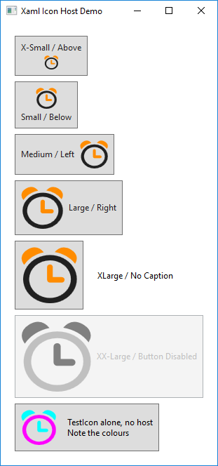
perXamlIconHost provides a placeholder for any WPF graphical object, including handling the change of colours for a disabled state, along with an optional text caption. However, rather than allowing an (almost) infinite range of colours as with a bitmap image, this control just supports two – primary and highlight which bind to the Foreground / BorderBrush properties of the host.
Note the control template for perXamlIconHost – the DataContext of the content presenter control is set to “self” which will allow the icon resource to bind to its foreground and borderbrush properties.
For those developers with limited artistic skills (which does include myself), Expression Blend includes a function to convert any text object (including symbol / glyph font families) into a WPF path definition. That will provide a good starting point, but does require some manual editing – not least because the converted paths are generated with way more decimal points than is necessary.
There are also a number of third party vendors of Xaml icon packs – a set such as IconEx O Collection will provide a consistent look and feel across an application for a decent price. I was actually already using this icon set when I came up with the idea for this control.
Look at the demo project for this post to see how such icons can be defined. Note that when the icon consists of multiple distinct path objects (e.g. for the different coloured elements), which will each stretch to fill the containing grid, they must each be coerced onto a common coordinate system. This is done with the pair of move elements at the start of each data string, which represent the boundaries of the image [the origin does not need to be at point (0,0) though, as in the example below]. The bound fill properties will be set to the appropriate brush – including taking into account the disabled state.
<Grid x:Key="TestIcon"
      x:Shared="False"
      Background="Transparent">

    <Path Data="M 20,35 M 180,210
                M 102.6,77.3 C 94.4,77.3 86.7,78.9 79.4,82.0 C 72.1,85.1 65.8,89.3 60.4,94.7 C 55.1,100.1 50.8,106.4 47.7,113.7 C 44.6,120.9 43.0,128.7 43.0,136.9 C 43.0,142.3 43.7,147.6 45.2,152.7 C 46.6,157.8 48.6,162.6 51.2,167.0 C 53.7,171.5 56.8,175.5 60.4,179.1 C 64.1,182.8 68.1,185.9 72.5,188.5 C 76.9,191.1 81.7,193.1 86.8,194.6 C 91.,196.0 97.1,196.7 102.6,196.7 C 108.1,196.7 113.3,196.0 118.4,194.6 C 123.4,193.1 128.1,191.1 132.6,188.5 C 137.0,185.9 141.0,182.8 144.6,179.1 C 148.2,175.5 151.3,171.5 154.0,167.0 C 156.6,162.6 158.6,157.8 160.0,152.7 C 161.4,147.6 162.2,142.3 162.2,136.9 C 162.2,131.4 161.4,126.1 160.0,121.0 C 158.6,116.0 156.6,111.2 154.0,106.8 C151.3,102.4 148.2,98.3 144.6,94.7 C 141.0,91.1 137.0,88.0 132.6,85.4 C 128.1,82.9 123.4,80.9 118.4,79.4 C 113.3,78.0 108.1,77.3 102.6,77.3 z
                M 102.6,60.3 C 109.6,60.3 116.4,61.2 122.9,63.0 C 129.5,64.9 135.6,67.4 141.3,70.8 C 146.9,74.1 152.1,78.2 156.8,82.9 C 161.5,87.5 165.5,92.7 168.8,98.4 C172.1,104.0 174.7,110.1 176.5,116.6 C 178.3,123.2 179.2,129.9 179.2,136.9 C 179.2,143.9 178.3,150.7 176.5,157.2 C 174.7,163.8 172.1,169.9 168.8,175.5 C165.5,181.2 161.5,186.4 156.8,191.1 C 152.1,195.7 146.9,199.7 141.3,203.1 C 135.6,206.4 129.5,209.0 122.9,210.8 C 116.4,212.6 109.6,213.5 102.6,213.5 C 95.6,213.5 88.8,212.6 82.2,210.8 C 75.7,209.0 69.6,206.4 63.9,203.1 C 58.3,199.7 53.1,195.7 48.4,191.1 C 43.7,186.42 39.7,181.2 36.4,175.5 C 33.1,169.9 30.5,163.8 28.7,157.2 C 26.8,150.7 25.9,143.9 25.9,136.9 C 25.9,129.9 26.8,123.2 28.7,116.6 C 30.5,110.1 33.1,104.0 36.4,98.4 C 39.7,92.7 43.7,87.5 48.4,82.9 C 53.1,78.2 58.3,74.1 63.9,70.8 C 69.6,67.4 75.7,64.9 82.2,63.0 C 88.8,61.2 95.6,60.3 102.6,60.3 z"
          Fill="{Binding Foreground, FallbackValue=Cyan}"
          Stretch="Fill" />

    <Path Data="M 20,35 M 180,210
                M 102.6,89.1 C 104.9,89.1 106.8,89.9 108.3,91.5 C 109.7,93.1 110.5,95.1 110.5,97.5 L 110.5,128.5 L 135.7,128.5 C 138.2,128.5 140.2,129.3 141.8,131.0 C 143.4,132.6 144.2,134.6 144.2,136.9 C 144.2,139.3 143.4,141.4 141.8,143.1 C 140.2,144.9 138.2,145.7 135.7,145.7 L 102.6,145.7 C 100.2,145.7 98.2,144.9 96.6,143.1 C 95.0,141.4 94.2,139.3 94.2,136.9 L 94.2,97.5 C 94.2,95.1 95.0,93.1 96.6,91.5 C 98.2,89.9 100.2,89.1 102.6,89.1 z
                M 142.0,35.9 C 145.2,35.9 148.6,36.5 152.0,37.6 C 155.5,38.7 159.1,40.6 162.8,43.2 C 168.6,47.2 172.8,51.4 175.3,56.0 C 177.8,60.5 179.1,65.1 179.1,69.8 C 179.1,72.7 178.6,75.6 177.8,78.5 C 176.9,81.3 175.7,84.2 174.2,87.0 C 170.8,82.2 167.1,77.8 162.9,73.8 C 158.7,69.7 154.1,66.2 149.2,63.1 C 144.3,60.0 139.1,57.4 133.5,55.3 C 127.9,53.2 122.2,51.6 116.3,50.6 C 119.6,46.1 123.5,42.6 127.8,39.9 C 132.1,37.2 136.8,35.9 142.0,35.9 z
                M 58.7,35.8 C 64.0,35.8 68.8,37.2 73.2,40.0 C 77.6,42.9 81.5,46.6 84.8,51.3 C 79.0,52.5 73.3,54.3 67.9,56.7 C 62.4,59.0 57.3,61.9 52.5,65.2 C 47.8,68.6 43.3,72.4 39.3,76.6 C 35.3,80.8 31.7,85.3 28.6,90.3 C 26.3,87.0 24.6,83.7 23.4,80.3 C 22.2,76.8 21.6,73.4 21.6,69.9 C21.6,65.1 22.9,60.5 25.4,56.0 C 27.9,51.4 32.0,47.2 37.7,43.3 C 41.5,40.7 45.1,38.8 48.6,37.6 C 52.1,36.4 55.5,35.8 58.7,35.8 z"
          Fill="{Binding BorderBrush, FallbackValue=Magenta}"
          Stretch="Fill" />
</Grid>
I haven’t done anything to the icon for mouse over events, instead preferring to keep that functionality in the button template.
The gaudy fallback colours on the Path.Fill bindings are a handy way of trapping usage of these icons outside of a perXamlIconHost object.
As usual the code samples for this blog are available on Github, along with my own personal C# / WPF library.
If you find this article useful, or you have any other feedback, please leave a comment below.